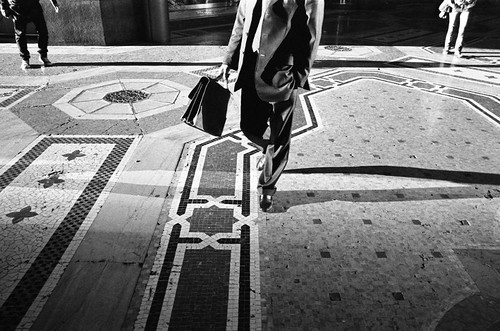
Thursday, 15 May 2008

Welsh Surfaces

I started a sort of serial of pictures of a roadtrip. All shot during one day in seven hours going from Cardiff to Port Talbot and back. The result is called Welsh Surfaces and was edited in about an hour. The boring well-composed (maybe classically composed should be better) colour snapshot style of it is not at all representative of how I shoot, but more of a joke, I guess.


The slideshow right now has 10 photographs, and every day I will add 5 more until the total of 28 is reached.

Wednesday, 7 May 2008

All tomorrow's parties...

I like shooting in parties. Birthdays, happy things. Somehow they lend themselves for double readings and anarchic compositions of people. I guess you have to be a bit cheeky when you look at things, but well, it's much more fun than do straightforward pictures of things.


I guess I just write this because it had been quite a while since the last time I uploaded any pics in this blog. Also, quite a while that they weren't in b&w. Well, happy birthday that is!


So, anybody has favourite party pictures?

(Both pics from last Saturday, by me.)

Sunday, 4 May 2008

La Pura Vida - April: beautiful consciousness, the flight of emily


La Pura Vida is a loose idea or sketch of a gallery that has been developing for over half a year on it's multiple basecamps on flickr. For the first time there is a final edited monthly issue available here: April - beautiful consciousness, the flight of emily. It's short, dreamy and nice, so you aren't wasting your time. Submissions are open for a darker, grittier, grainier May issue on this group on flickr. Over there you can also see currently accepted submissions. As usual, I'll see if they find anything fitting in my vaults...

Bryan Formhals, Raoul Gatepin, James Hendrick and Ludmilla Morais are to be credited for this project and Nathalia Mendes for the photograph in this post.

Friday, 2 May 2008

Editing: think positive

My friends are sometimes down because of editing their images, essays, sequences, projects, collections, sets, whatever you might want to call them. I think there's a misconception that editing your work is the end of the road, that last thing you do before you call it a day. Probably I saw editing like that a while ago... when you go through your images and say, "man, this isn't good enough", "oh, I have three good images of X, but nothing else to interleave", "I have eight shots of Y, but only one goes in, which one?", "stupid, in this kind of pictures all the characters are girls", etc. Suddenly nothing keeps the pace, the thing falls apart, it turns tedious, or too strong or too soft or too fast or just doesn't work... and then you want to find a nice tree and kick the bucket.

I mean, it's hard to come up with an idea clear enough of something to shoot, and go and tick all the 'compositions', 'locations' and 'topics' boxes. Plus your idea might have been immensely unsatisfactory for yourself and you didn't realize it. Nowadays I find the first edit of anything that I'm shooting a very creative process... it's the first time that I see what I am shooting and how I want to follow it. Yeah, follow it, because it's not the end, it's more, I'd say that something is not a project in my head till I have edited at least once. Once I am done, instead of seeing all the things that the edit is lacking and go to find a very tall tree, I think about how I am going to shoot them. Suddenly, from the images new branches and paths emerge. You can easily plan ahead what images to drop completely ('lets get rid of all the portraits', e.g.) and what to follow. Where there are gaps on the edit that need a certain pace, whether you have tried a certain shot too many times without noticing it, whether you have biased yourself to give a certain message to the whole when actually, under the surface, something more quiet but stronger resides. So if you are thinking about your first (painful) edit... cheer up! It's still only the beginning!

Anyhow, if I come up as too optimistic, well, give a go at Always Look at the Bright Side of Life.

Thursday, 1 May 2008

The z-series

Back in the day, a few months ago, we started a thread in HCSP called please don't waste our time. It was mostly to show to the members of the group what kind of photographs we don't want to see submitted once and again to the group. I thought that we had not used this thead a lot, but today I realized that it has 263 comments in it. I understand that having more than 21k members that potentially can submit stuff to the group means that we have to go through lots of crap, but most of it is not amazingly shocking enough for us to go on to this thread (oh, I had to correct a typo there that read 'shit thread') and post the image.

Some of it is so bad that it turns... well, maybe not good, but worth a look at. Take this one, for example:


Potentially homeless person, selective desaturation and shot through a mirror. I mean, when would I have come up with that one? It has so many of the elements that make an admin's finger go towards the reject button that is surprising that it lived long enough for being highlighted in the thread.

Or this one.


The creative use of the frame and certain elements that might be postproduced guide you towards the main topic of the image in case you were missing it. I would be interested in seeing what sort of postproduction that image would have had if one of the subjects was the photographer's ex.


Loads of postprocessing on top of a potentially interesting image. Hum.

Oh, I can't even remember how many times I've rejected this one:


But somehow, nothing beats the day that I deleted this image from some long time ago lost vaults of the group...


This reminds me that What the Duck is having an excellent series of daily comics on the issue of photoshopping. Like this one:


Also, don't miss Photoshop Disasters.

Sunday, 27 April 2008

Editing and horror films

This is going to be a confusing post. Stills from The Shining, general chitchat about editing photoessays and a review of The Orphanage. Sorry about that.


Last week I saw The Orphanage (El Orfanato). It's a ridiculously good Spanish horror film, that works in several subtle layers and has that classic buildup tension that good -and nowadays fairly rare- horror films have. Actually, there are not that many really frightening moments in the film, but they are sometimes so tightly knit together, and others they are so unexpected that they make a great film. On the background you have this strange arousal... all the time something is a bit wrong about the whole film but there you sit watching. Is probably these moments in which nothing scary really happens that makes the film stand out. If it was all the time bang bang, ghost here, ghost there, people dying, etc. it would have been crap. Instead, it's an extremely well paced and thought film. Exactly like editing pictures, at least for me.


With editing pictures... selecting and arranging a photoessay, I find that the best way of describing my modus operandi is some sort of horror film. You start by hinting that something is going to happen or something is slightly wrong or crooked about all this. It doesn't require a strong internal logic, just something ambiguous, worrying. Then you try to get into the stronger shots by building up tension to them. Some things that you want to cover with the images don't somehow work together (last edit I did managed to contain two portraits, I still don't know how I pulled that one), so somehow the sequence should lean in their direction without losing the main track. Once you get into the particular strong shot, you can sometimes follow with another very strong shot, a bit like those shocking aftershocks of horror films, but doing it too often creates too much of an expectation. It's all about guiding the viewer's state of mind through the images... to play with that theoretical observer that might look at the sequence, hopefully being absolutely naive by when they start.


Of course it's not all frights. The Orphanage contains that little bit of drama that reminds you that the characters are still human beings after all, that you could be one of them. It opens with a happy and long scene, that just makes you more worried on your seat, as you expect the awful to happen, but not. There the orphanage is, back in the fifties, probably, and all this kids that nobody really wants are playing in the garden, chasing each other. You barely need this in terms of the story itself, but it's setting the mood. It's like a backdrop that you get back to when you are viewing the rest of the story. Half way through the film there's a big pause. The whole story moves forward by six months and sort of resets. It had got to one of its peaks in terms of horror, the plot had advanced suddenly, your nerves don't take it much more. Then the pause comes and gently everything resets a bit. All the paranormal lightens and you get back into reality and into the characters. You sort of need this to take another good dose of horror.


A tight pace, a sequence of images without bumps, up and down, an "easy" ride for the viewer. Reaching the peaks and playing with expectations. Sudden but announced shocks every now and then. A coherent whole that goes around hitting very different images. Hide the repetitions, don't put them together... returning to some motives gives it a beat. Not too obvious either, just hinting to things that will come and reminding of things seen. Of course there are lots of exceptions, not all sequences are horror films, but I do love horror films. Damn.

Wednesday, 16 April 2008

Boredom, photographs, paintings, art

I remember when in primary I saw for the first time Duchamp's Nude Descending a Staircase...


We had just got out of impressionism, and hitting abstraction, cubism and futurism. On Duchamp's painting I stopped and said, damn, I see it! Well, it's not as if you couldn't see all the stuff, but most of it was fairly obscure (like music for musicians we do have art for artists, I'd say). But, hey, here you could stop for a moment and actually think that that is, in a sketchy way, what a person looks over time when they walk down a staircase. Everything superimposed. Seeing this so many years later took me to reading the wikipedia entry, and it has this interesting bit...

In the composition, Duchamp depicted motion by successive superimposed images, similar to stroboscopic motion photography. The painting shows elements of both the Cubist and Futurist styles. Duchamp also recognized the influence of the stop-motion photography of Étienne-Jules Marey.


Well, the influence of that was recognized looks like this:


- Man walking down an inclined plane


- Horse walking


- Pelican landing


That makes Duchamp look a lot easier actually. And it somehow brings me full circle to photography and Trenk Parke...