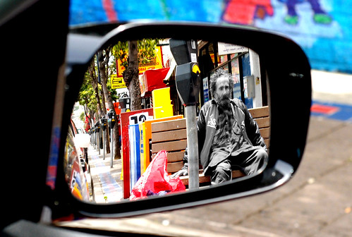
Some of it is so bad that it turns... well, maybe not good, but worth a look at. Take this one, for example:

Potentially homeless person, selective desaturation and shot through a mirror. I mean, when would I have come up with that one? It has so many of the elements that make an admin's finger go towards the reject button that is surprising that it lived long enough for being highlighted in the thread.
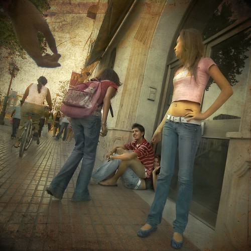
Or this one.

The creative use of the frame and certain elements that might be postproduced guide you towards the main topic of the image in case you were missing it. I would be interested in seeing what sort of postproduction that image would have had if one of the subjects was the photographer's ex.

Loads of postprocessing on top of a potentially interesting image. Hum.
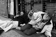
Oh, I can't even remember how many times I've rejected this one:

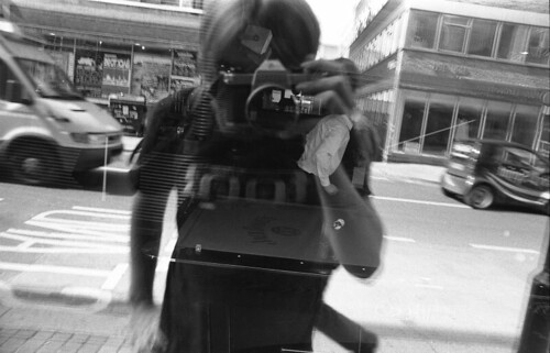
But somehow, nothing beats the day that I deleted this image from some long time ago lost vaults of the group...

This reminds me that What the Duck is having an excellent series of daily comics on the issue of photoshopping. Like this one:

Also, don't miss Photoshop Disasters.

1 comment:
I kinda like that first one too. Not much craft and not my approach but nevertheless.
www.bennettlevinephotographs.com
Post a Comment