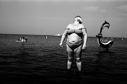
This stunning shot by Igor Moukhin has an equally stunning comment by a viewer in flickr. The text, in its original form says:
By the way, the lady was shot in a very unfavorable pose. I am sure she
did not like it.
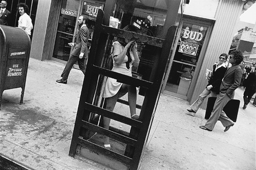
Don't know. If that's a reason to bin the picture, I'm a bit shocked. All that surreality in a single stroke, even the dynamism given by the slight slant of what would be an ordinary line in the image. As usually, after reading such a thing I decided to straighten another picture taken by Garry Winogrand. Lets go for it...
Before

After

I don't know about you, but the straight image leaves me a bit cold. Yes, anybody could have shot that. Some woman inside a phone booth. One leg up, a bit sexy maybe.
Lets see the original again...

Isn't there something interesting about it? It's sort of 'cheekily wrong' but at the same time it draws you into completely new parts of the image which follow with different ideas. First, I notice the legs a lot more than I did before. The woman suddenly looks as if she's really locked inside the booth. Her legs are the only close-to-vertical pillar that draws my eyes in the image. She's more separated from her context than in the straight image. If that was a real hill you could think that she's standing on the wall of the phone booth. All the people in the background are walking uphill as well and we have that face on the top left corner. If the shot was straight we would have seen too much of the sidewalk on the right, even more people. And I like all those diagonals of the booth, a bit of which covers the face of the girl. Just lovely. The straight one is just boring in comparison.
The whole thing is that the image itself is self contained. When we walk around we can tilt our head in any direction and still everything looks at level with the horizon. I guess that it's not only due to our vestibular system in action, probably we have learned to normalize our horizon when seeing. Photography allows you to put a frame around an image, for the first time creating a tilt that can not be normalized as it's inside a square. This is a whole new world of visual experiences that can be explored. The hard thing is to create an image that in the reference coordinates of the image is balanced and natural, even if it does not agree with the references of the real world. Somewhere the tilted image (relative to world coordinates) has to be 'anchored' well enough for it to not result disturbing.
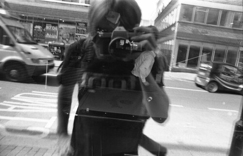
- What's with the tilt in your pictures?
- What tilt?
Rock on.

2 comments:
Very interesting reflection.
http://www.flickr.com/groups/fds/discuss/72157603747472918/
Post a Comment